Analysis of Average House Prices in Poznań/Poland for 2022
GOAL
RESULT
PROJECT DURATION
Create an insightful and visually engaging Tableau dashboard analyzing average house prices in Poznan using OLX data.
Deliver an interactive dashboard featuring a heat map of average house prices in Poznan, along with visualizations depicting the distribution of square meter living, house prices, and room counts. The result is an accessible tool for users to explore and understand real estate market trends in Poznan.
The estimated duration of the project is 1 to 7 days, depending on the availability, completeness, and cleanliness of the data.
Continuous testing and refinement ensured the accuracy of insights, resulting in a polished and user-friendly dashboard.
CASE – POZNAŃ HOUSING INSIGHTS DASHBOARD
As part of this project, I utilized data from OLX (A popular online marketplace) to design a visually appealing and informative Tableau dashboard that analyzes the average house prices in Poznan. The dashboard combines geographical and numerical data to provide a comprehensive overview of the real estate market in the area.
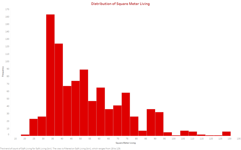
Distribution of Square Meter Living
This histogram illustrates the distribution of square meter living areas in Poznan. It enables viewers to understand the range and concentration of living spaces available in the market.
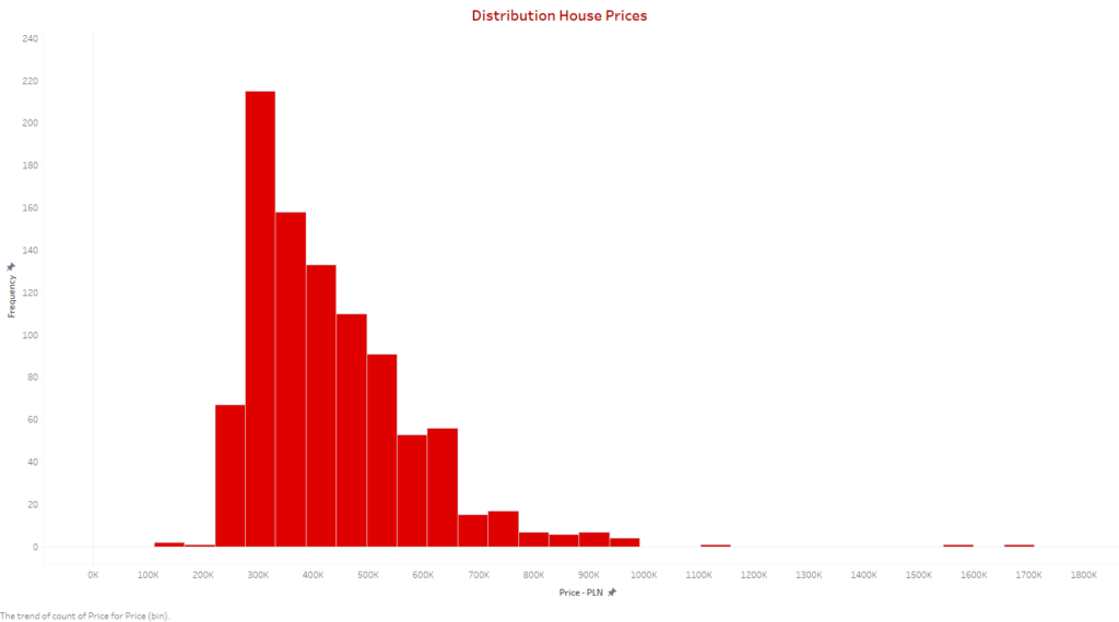
Distribution of House Prices
The chart of house prices in Poznan provides a clear overview of the city’s housing market, indicating frequency and range of prices for informed decision-making.
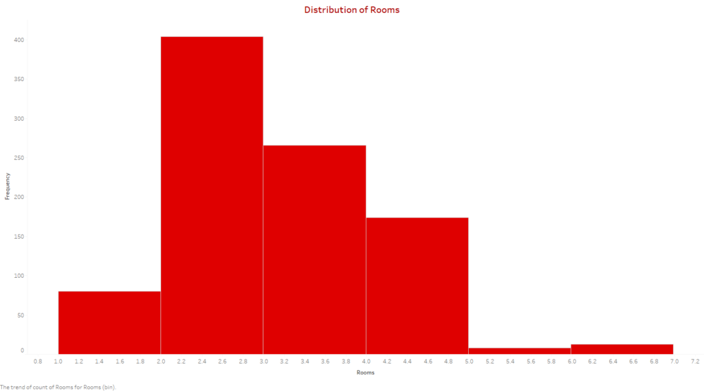
Distribution of Rooms
This visualization offers a comprehensive understanding of the types of properties available in Poznan by focusing on the distribution of house sizes. It is a valuable tool for anyone seeking to gain confidence in the housing market.
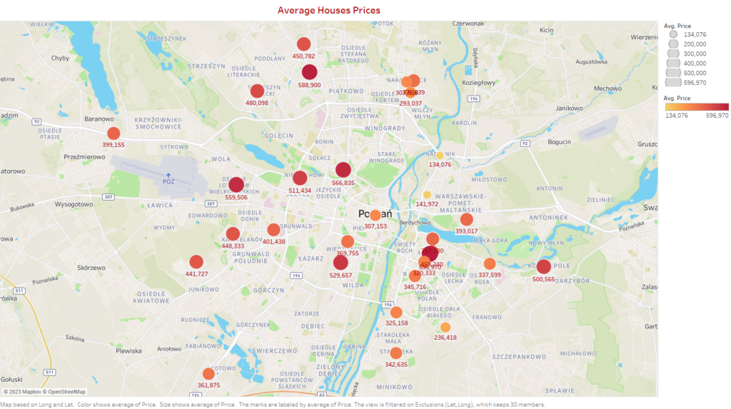
Average House Price Heat Map
The interactive map offers a comprehensive visual representation of the average house prices across Poznan, enabling users to easily identify areas with varying property values. The map utilizes an intuitive heat map that utilizes a color gradient to depict the pricing trends in a clear and concise manner. With this helpful tool, users can gain a better understanding of the real estate landscape in Poznan, making informed decisions about buying or selling properties.
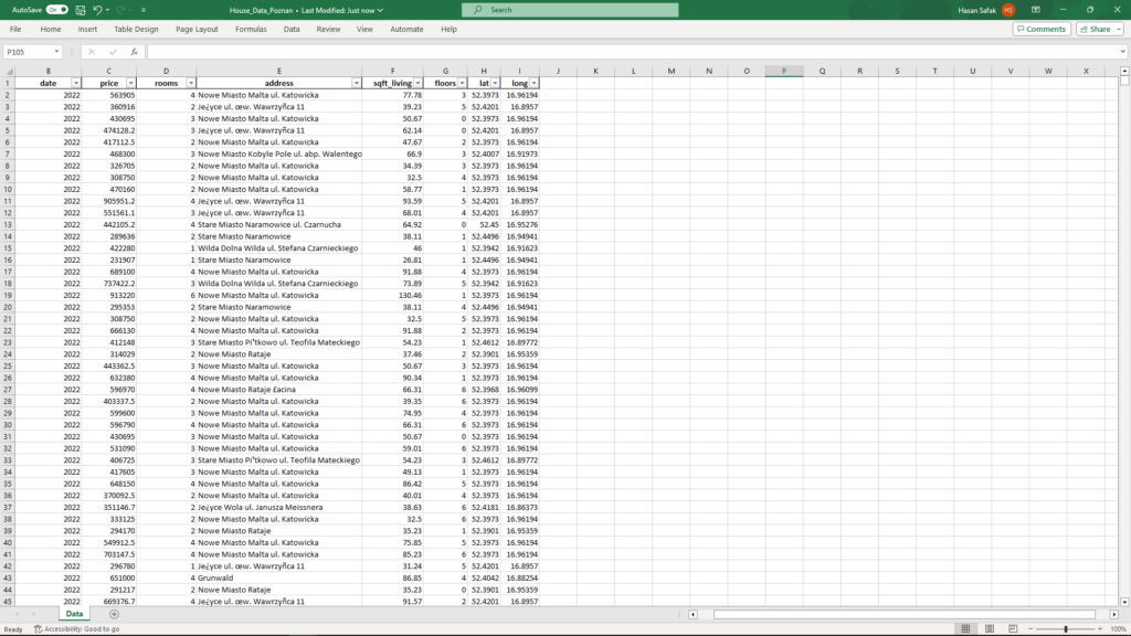
Data Source: The data for this analysis was sourced from OLX, an online marketplace. The Excel file with information about house prices, living space, and room distribution was used to create visualizations.
Conclusion: The Poznan Average Sales Price Analysis Dashboard is a resource for anyone interested in the real estate market in Poznan. It provides an interactive and informative experience that makes it easy to explore and gain insights into the housing trends in the city, regardless of whether you are a potential buyer, seller, or simply a real estate enthusiast.
How to Use: Users can navigate the dashboard by exploring a heat map and adjusting filters for living space, house prices, and room distribution. The interactive visualizations provide an easy-to-use experience for understanding Poznan’s real estate market.
Explore the Poznan Average Sales Price Analysis Dashboard and unlock the insights that matter to you!
You can access my dataset from my GitHub and Kaggle profiles below. You have the option to modify and save them for your personal use.
GitHub
Tableau

Kaggle
