AMAZON REVIEWS ANALYSIS
GOAL
RESULT
PROJECT DURATION
Develop a comprehensive analysis of Amazon product reviews, leveraging data manipulation, visualization, and sentiment analysis techniques using Python libraries.
Delivered an insightful report with in-depth analysis of user review behaviors, text analysis of reviews, and sentiment assessment. The project offers a detailed understanding of customer feedback on Amazon products, identifying patterns in review content, user activity, and sentiment trends.
The project, which included data collecting, cleaning, analysis, and visualization, took around a week to complete.
CASE – AMAZON CUSTOMER REVIEWS ANALYSIS
For this project, we accessed Amazon review data from a SQLite database. The data includes various aspects of customer reviews and ratings for different products.
Data Loading and Initial Setup
Tools and Libraries Used
We leveraged a collection of several Python libraries to facilitate efficient data analysis.
Pandas for efficient data handling,
Numpy for numerical computations,
Matplotlib and Seaborn for insightful visualizations,
TextBlob for sentiment analysis.
Sqlite3 for database functionality into Python.
import pandas as pd
import numpy as np
import seaborn as sns
import matplotlib.pyplot as plt
import sqlite3con = sqlite3.connect('C:/Users/msr-h/OneDrive/Python/8 - Amazon Sentimentel Analysis/database.sqlite')This line connects to a SQLite database located at the given file path, assigning the connection object to con.
type(con)type(con) checks and returns the data type of the variable con.
This
Reading Data from the SQL Database
df = pd.read_sql_query("SELECT * FROM REVIEWS" , con)This line reads data from the SQLite database table named “REVIEWS” using a SQL query, and stores the result into a pandas DataFrame named df.
df.shapedf.shape returns the number of rows and columns in the DataFrame df.
Data Preperation
type(df) df.head(3)
df.columns
df['HelpfulnessNumerator'] > df['HelpfulnessDenominator'] This line performs a comparison between the values in the ‘HelpfulnessNumerator’ column and the values in the ‘HelpfulnessDenominator’ column of the DataFrame ‘df’, returning a boolean Series indicating whether each value in ‘HelpfulnessNumerator’ is greater than the corresponding value in ‘HelpfulnessDenominator’.

df[df['HelpfulnessNumerator'] > df['HelpfulnessDenominator']]This line filters the DataFrame df to include only the rows where the value in the ‘HelpfulnessNumerator’ column is greater than the corresponding value in the ‘HelpfulnessDenominator’ column. It returns a new DataFrame containing these filtered rows.

df_valid = df[df['HelpfulnessNumerator'] <= df['HelpfulnessDenominator']]This line filters the DataFrame df to keep only the rows where ‘HelpfulnessNumerator’ is less than or equal to ‘HelpfulnessDenominator’, and assigns the result to a new DataFrame df_valid.
df_valid.columnsThis line retrieves the column names of the DataFrame df_valid.

df_valid.duplicated(['UserId', 'ProfileName' ,'Time' ,'Text'])This line filters the DataFrame df_valid to include only the rows that are duplicates based on the columns ‘UserId’, ‘ProfileName’, ‘Time’, and ‘Text’. It returns a DataFrame containing these duplicate rows.
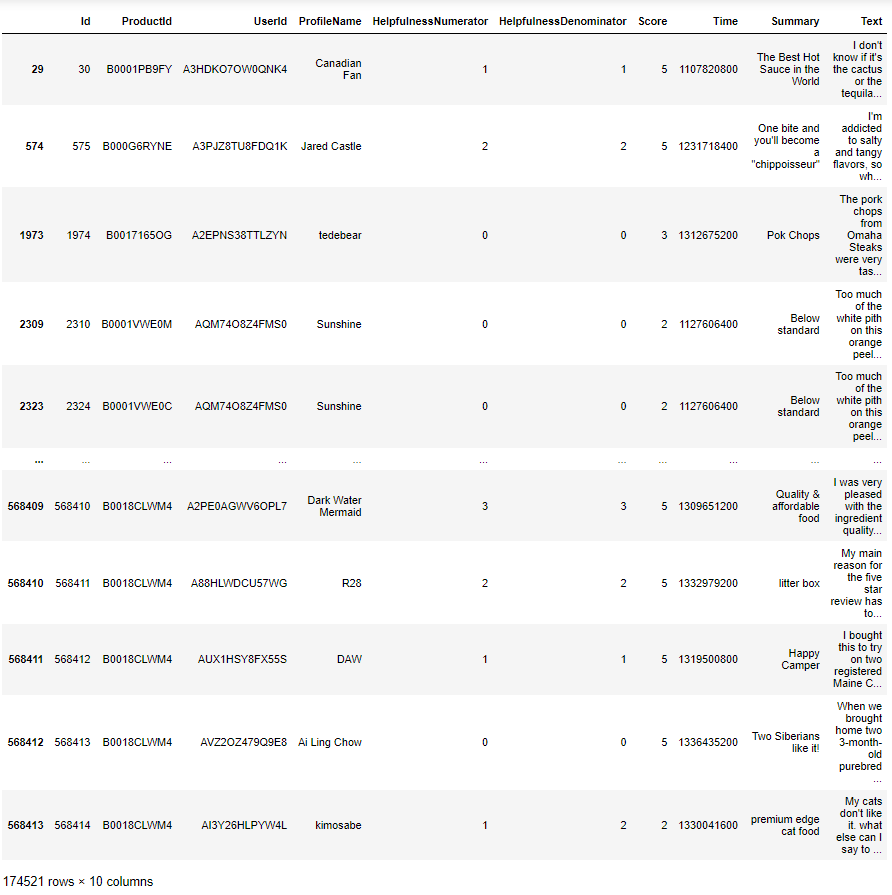
data = df_valid.drop_duplicates(subset=['UserId', 'ProfileName' ,'Time' ,'Text'])This line creates a new DataFrame named data by removing duplicate rows from the DataFrame df_valid based on the columns ‘UserId’, ‘ProfileName’, ‘Time’, and ‘Text’.
data.shapedata.dtypesThis line returns the data types of each column in the DataFrame data.

data['Time']This line retrieves the values in the ‘Time’ column of the DataFrame data.

pd.to_datetime(data['Time'])This line converts the values in the ‘Time’ column of the DataFrame data to datetime objects using the pd.to_datetime() function from the pandas library.

data['Time'] = pd.to_datetime(data['Time'] , unit='s')This line converts the values in the ‘Time’ column of the DataFrame data to datetime objects, assuming the values represent time in seconds since the epoch, using the pd.to_datetime() function from the pandas library with the unit='s' parameter. Then, it assigns these converted datetime objects back to the ‘Time’ column in the DataFrame data.

import warnings
from warnings import filterwarnings
filterwarnings('ignore')
This code block imports the warnings module and specifically imports the filterwarnings function from it. Then, it sets up a filter to ignore all warnings, effectively suppressing any warning messages that would be raised during the execution of the code.
data.shapedata.columnsdata['ProfileName']This code retrieves the values in the ‘ProfileName’ column of the DataFrame data.

data['ProfileName'].unique()This code returns an array containing the unique values in the ‘ProfileName’ column of the DataFrame data.
data['UserId'].nunique()This code returns the number of unique values in the ‘UserId’ column of the DataFrame data.
data.columns
data.groupby(['UserId']).agg({'Summary':'count' , 'Text':'count' , 'Score':'mean' ,'ProductId':'count' })This code groups the DataFrame data by user IDs and calculates various statistics for each user, such as the count of summaries and texts, the mean score, and the count of products reviewed by each user.
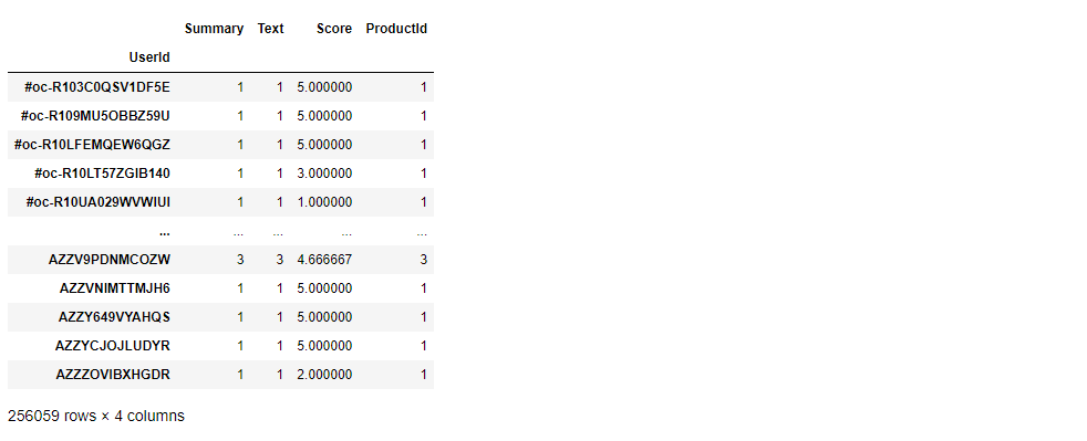
recommend_df = data.groupby(['UserId']).agg({'Summary':'count'
                                             , 'Text':'count' , 'Score':'mean'
                                             ,'ProductId':'count'  }).sort_values(by='ProductId' , ascending=False)
This line groups the DataFrame data by user IDs, calculates statistics such as the count of summaries, count of texts, mean score, and count of products reviewed by each user. Then, it sorts the resulting DataFrame in descending order based on the count of products reviewed and assigns it to the DataFrame recommend_df.
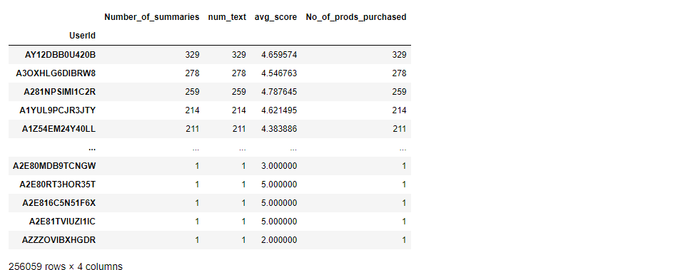
recommend_df.columns = ['Number_of_summaries' , 'num_text' , 'avg_score' , 'No_of_prods_purchased']Let’s rename the columns
recommend_dfThis is our DataFrame with columns renamed as follows: ‘Number_of_summaries’, ‘num_text’, ‘avg_score’, and ‘No_of_prods_purchased’.
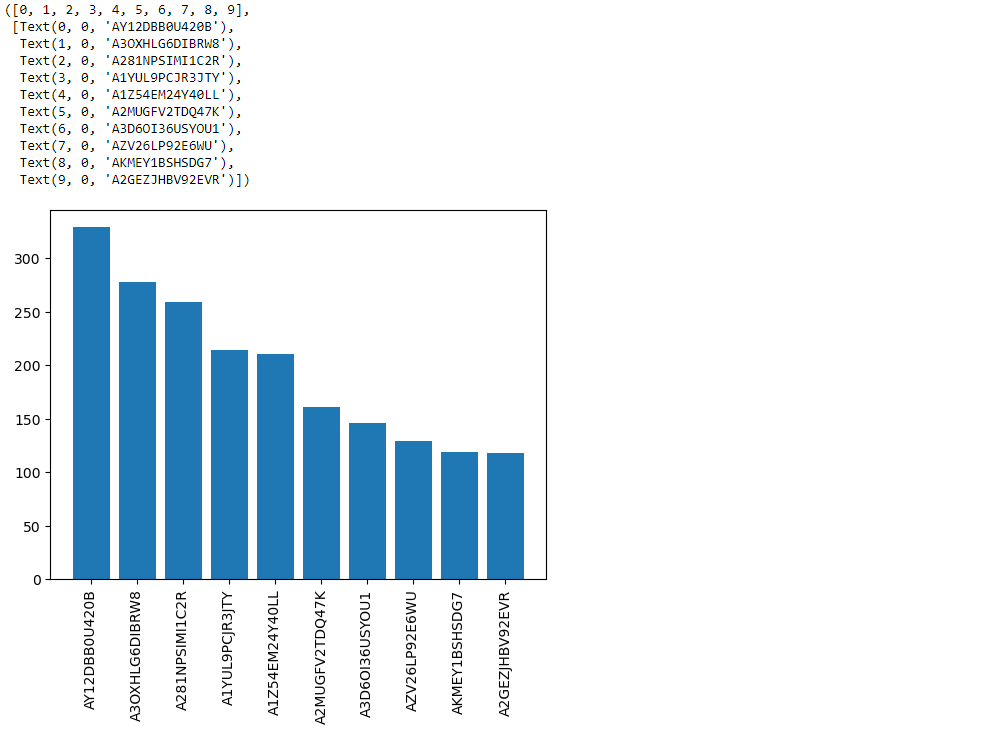
recommend_df.index[0:10]This code retrieves the index (user IDs) of the first 10 rows in the DataFrame recommend_df.

recommend_df['No_of_prods_purchased'][0:10].valuesThis code retrieves the values of the ‘No_of_prods_purchased’ column for the first 10 rows in the DataFrame recommend_df.
plt.bar(recommend_df.index[0:10] , recommend_df['No_of_prods_purchased'][0:10].values)

plt.xticks(rotation='vertical')
This code creates a vertical bar plot using matplotlib (plt.bar()) with the user IDs as the x-axis and the number of products purchased as the y-axis. It plots the first 10 users’ data from the DataFrame recommend_df. The line plt.xticks(rotation='vertical') rotates the x-axis labels vertically for better readability.
data.columnsdata['ProductId'].unique()This code returns an array containing the unique values in the ‘ProductId’ column of the DataFrame data, which represent unique product identifiers.
len(data['ProductId'].unique())This code line finds the number of unique products in the dataset by counting the unique values in the ‘ProductId’ column.
data['ProductId'].value_counts()
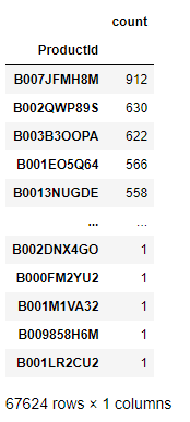
data['ProductId'].value_counts().to_frame()This code creates a DataFrame that counts the occurrences of each unique product ID in the ‘ProductId’ column of the dataset.
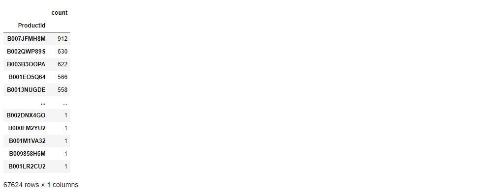
prod_count = data['ProductId'].value_counts().to_frame()This line creates a DataFrame named prod_count that counts the occurrences of each unique product ID in the ‘ProductId’ column of the dataset.
prod_countThis is our Database.
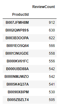
prod_count.columns = ['ReviewCount']

most_reviewed_products = prod_count[prod_count['ReviewCount'] > 500]
This code renames the column in the DataFrame prod_count to ‘ReviewCount’. Then, it filters the DataFrame to include only those products with a review count greater than 500, storing the result in a new DataFrame called most_reviewed_products.
most_reviewed_productsmost_reviewed_products contains the products with review counts greater than 500, listed along with their respective review counts in the DataFrame.
freq_prod_ids = prod_count[prod_count['ReviewCount']>500].indexWtih this line let’s extracts the product IDs of the products with review counts greater than 500 and stores them in the variable freq_prod_ids.
freq_prod_idsThis is our product ID’s.

data['ProductId'].isin(freq_prod_ids)And let’s checks whether each product ID in the ‘ProductId’ column of the DataFrame data is included in the list of frequent product IDs stored in the variable freq_prod_ids. This code line returns a boolean Series indicating whether each product ID is among the frequent ones.
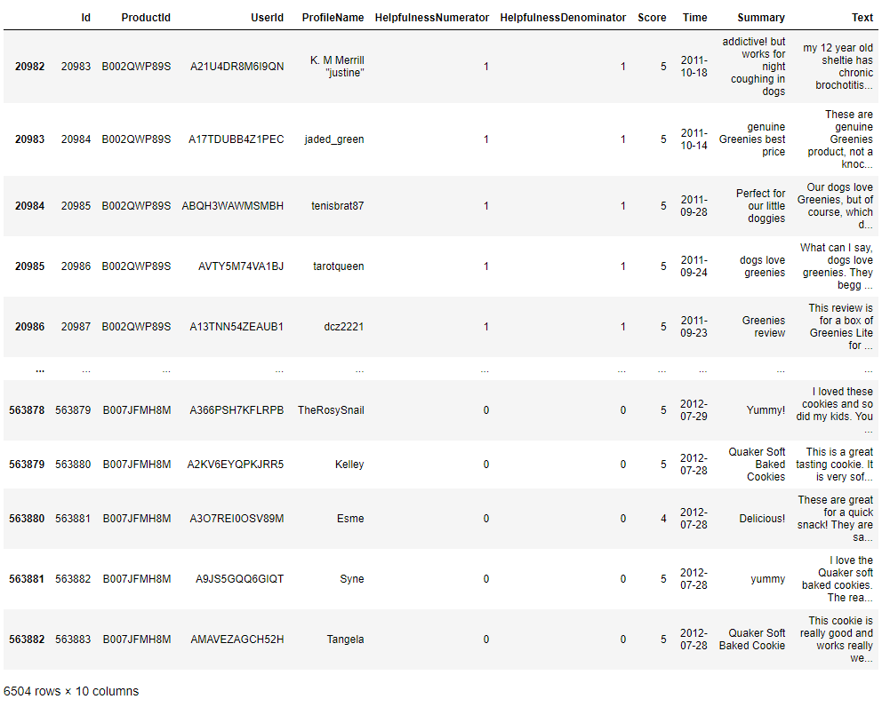
fre_prod_df = data[data['ProductId'].isin(freq_prod_ids)]This line creates a new DataFrame named fre_prod_df by filtering the DataFrame data to include only the rows where the product ID is among the frequent product IDs stored in freq_prod_ids.
fre_prod_dfReviewed more than 500 times.
fre_prod_df.columns
sns.countplot(y = 'ProductId' , data = fre_prod_df)This code generates a visual representation using seaborn (sns.countplot()) that shows the count of occurrences for each product ID along the y-axis. The frequency of each product’s occurrence in the dataset fre_prod_df is represented by the height of the corresponding bar.
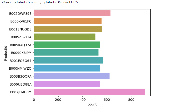
This chart is a visualization of product popularity in our dataset. Each horizontal bar represents the number of times a product appears, with the longest bar at the bottom indicating our most common product. It’s a quick way to see which items are most and least frequent.
sns.countplot(y = 'ProductId' , data = fre_prod_df , hue='Score')This code creates a count plot using seaborn (sns.countplot()) with the ‘ProductId’ column as the y-axis. The count of occurrences for each product ID is displayed, with bars grouped by the ‘Score’ column, showing the distribution of scores for each product in the dataset fre_prod_df.
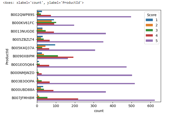
In this chart:
- Each horizontal bar represents a different
ProductId. - The length of each bar indicates the total count of that particular product in the dataset.
- The bars are segmented into different colors, with each color representing a ‘Score’—this is likely some sort of rating or category.
The legend on the right side of the chart corresponds to the ‘Score’ with values from 1 to 5, each assigned a specific color. These scores segment the bars, allowing us to see not just how many times each product appears, but also the distribution of scores within those appearances.
For instance, if we look at the bottom bar, we can see that ‘Product B007JFMH8M’ not only has the highest overall count but also has contributions from all five score categories, indicating a diverse range of ratings.
data.columnsdata['UserId']data['UserId'].value_counts()This code counts the occurrences of each unique user ID in the ‘UserId’ column of the DataFrame data. It returns a Series where the index contains the unique user IDs and the values represent the number of occurrences of each user ID.

data.head(5)
x = data['UserId'].value_counts()This code calculates the occurrences of each unique user ID in the ‘UserId’ column of the DataFrame data and assigns the result to the variable x.
x
x['AY12DBB0U420B']This code retrieves the count of occurrences for the user ID ‘AY12DBB0U420B’, which appears 329 times in the dataset.
data['UserId'].apply(lambda user : "Frequent" if x[user]>50 else "Not Frequent")This code applies a lambda function to each user ID in the ‘UserId’ column of the DataFrame data. If a user’s ID appears more than 50 times in the dataset (x[user] > 50), it assigns the label “Frequent” to that user; otherwise, it assigns the label “Not Frequent”.
data['viewer_type'] = data['UserId'].apply(lambda user :
                                           "Frequent" if x[user]>50 else
                                           "Not Frequent")
This code creates a new column named ‘viewer_type’ in the DataFrame data. It assigns a label to each user based on their frequency of occurrence in the dataset. If a user’s ID appears more than 50 times (x[user] > 50), they are labeled as “Frequent”; otherwise, they are labeled as “Not Frequent”.
data.head(10)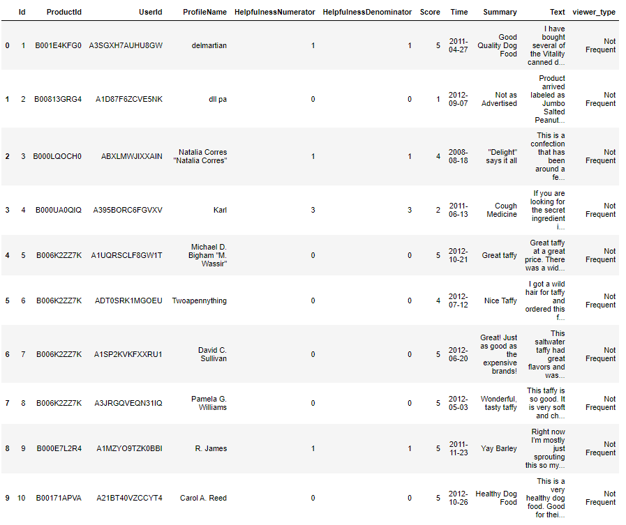
data['viewer_type'].unique()This code retrieves the unique values in the ‘viewer_type’ column of the DataFrame data, which represent the different types of viewers identified based on their frequency of occurrence in the dataset.
data['viewer_type']=='Not Frequent'And let’s create a boolean Series indicating whether each viewer in the DataFrame data is labeled as “Not Frequent” in the ‘viewer_type’ column.
data[data['viewer_type']=='Not Frequent']This code retrieves the rows from the DataFrame data where the viewers are labeled as “Not Frequent” in the ‘viewer_type’ column.

not_freq_df = data[data['viewer_type']=='Not Frequent']

freq_df = data[data['viewer_type']=='Frequent']
This code separates the DataFrame data into two separate DataFrames: not_freq_df, containing rows where the viewers are labeled as “Not Frequent” in the ‘viewer_type’ column, and freq_df, containing rows where the viewers are labeled as “Frequent”.
not_freq_df['Score'].value_counts()This code calculates the count of each unique score in the ‘Score’ column of the DataFrame not_freq_df, which contains rows where viewers are labeled as “Not Frequent” in the ‘viewer_type’ column.
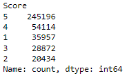
freq_df['Score'].value_counts()This code calculates the count of each unique score in the ‘Score’ column of the DataFrame freq_df, which contains rows where viewers are labeled as “Frequent” in the ‘viewer_type’ column.
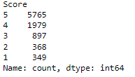
freq_df['Score'].value_counts()/len(freq_df)*100Let’s see the percentage distribution of each unique score in the ‘Score’ column of the DataFrame freq_df, which contains rows where viewers are labeled as “Frequent” in the ‘viewer_type’ column.

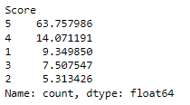
not_freq_df['Score'].value_counts()/len(not_freq_df)*100And let’s calculate for “Not Frequent”.
freq_df['Score'].value_counts().plot(kind='bar')This code creates a bar plot using the pandas plot() function, showing the count of each unique score in the ‘Score’ column of the DataFrame freq_df, which contains rows where viewers are labeled as “Frequent” in the ‘viewer_type’ column.
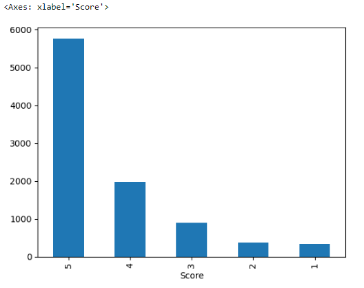
The bars represent the count of occurrences for each score, with the tallest bar corresponding to the score of ‘5’, indicating it is the most frequent score in the dataset.
not_freq_df['Score'].value_counts().plot(kind='bar')Same script but for DataFrame name is not_freq_df, which contains rows where viewers are labeled as “Not Frequent” in the ‘viewer_type’ column.
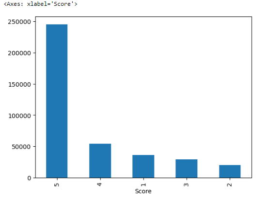
The x-axis is labeled ‘Score’, showing different score categories (the scores are listed out of order, possibly due to the sorting by value counts).
The y-axis indicates the frequency of each score, and the scale goes up to over 200,000, suggesting a large dataset.
The bars represent the count of each score’s occurrence in the dataset, with the score of ‘5’ being the most frequent.
data.columnsdata['Text']Now we will be retrieving the values in the ‘Text’ column of the DataFrame data, which contains text reviews or descriptions associated with each entry in the dataset.
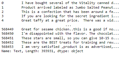
data[['UserId' , 'ProductId' , 'Text']]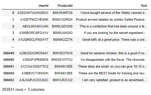
data['Text'][0]Our first entry in the ‘Text’ column.

type(data['Text'][0])This
type(data['Text'][0].split(' '))len(data['Text'][0].split(' '))The output indicates that there are 49 words in the text.
def calculate_length(text):
    return len(text.split(' '))
This code defines a function named calculate_length that takes a string text as input. Inside the function, it splits the input text by spaces and calculates the number of resulting words. Finally, it returns the length of the text in terms of the number of words.
data['Text'].apply(calculate_length)This code applies the calculate_length function to each entry in the ‘Text’ column of the DataFrame data, calculating the number of words in the text content of each entry.
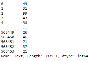
data['Text_length'] = data['Text'].apply(calculate_length)This code creates a new column named ‘Text_length’ in the DataFrame data. It calculates the number of words in the text content of each entry in the ‘Text’ column using the calculate_length function and assigns the result to the new column.
data['viewer_type'].unique()not_freq_data = data[data['viewer_type']=='Not Frequent']
freq_data = data[data['viewer_type']=='Frequent']This code separates the DataFrame data into two separate DataFrames: not_freq_data, containing rows where the viewers are labeled as “Not Frequent” in the ‘viewer_type’ column, and freq_data, containing rows where the viewers are labeled as “Frequent”.
not_freq_data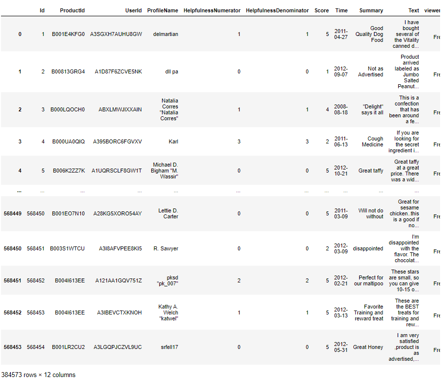
freq_data
fig = plt.figure()

ax1 = fig.add_subplot(121)
ax1.boxplot(freq_data['Text_length'])
ax1.set_xlabel('Freq of Frequence Reviewers')
ax1.set_ylim(0,500)

ax2 = fig.add_subplot(122)
ax2.boxplot(not_freq_data['Text_length'])
ax2.set_xlabel('Freq of Not-Frequence Reviewers')
ax2.set_ylim(0,500)
This code creates a figure with two subplots using matplotlib.
In the first subplot (ax1), it plots a boxplot of the text lengths for the frequent reviewers (freq_data['Text_length']). The x-axis label is set to ‘Freq of Frequent Reviewers’, and the y-axis limit is set from 0 to 500.
In the second subplot (ax2), it plots a boxplot of the text lengths for the not-frequent reviewers (not_freq_data['Text_length']). The x-axis label is set to ‘Freq of Not-Frequent Reviewers’, and the y-axis limit is also set from 0 to 500.
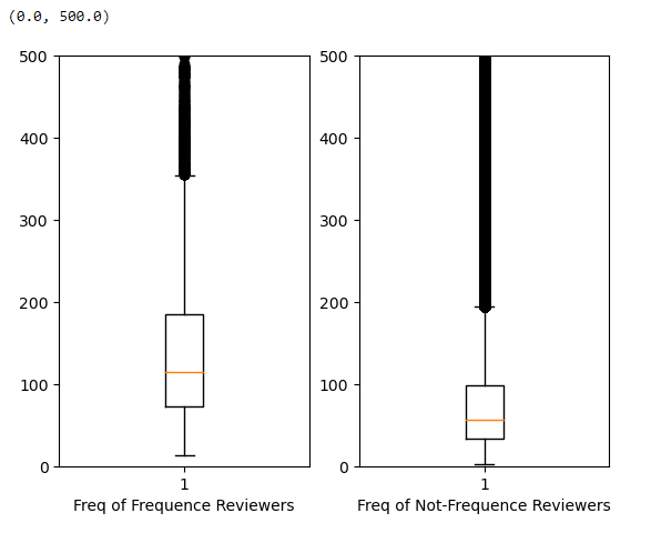
Frequency Reviewers: This group those who review products frequently. The box plot for this group shows the quartiles, median (indicated by the orange line), and potential outliers for the length of the text they’ve written.
Not-Frequency Reviewers: This group those who review products infrequently. Similar to the first, the plot shows the distribution of their text lengths.
Both plots are set with the same y-axis limit (0 to 500), which allows for an easy comparison between the two groups. The long vertical lines (whiskers) extending from the boxes indicate the range of the data, excluding outliers. The points beyond the whiskers could be considered outliers.
Key Observations:
Both groups have a similar range of text lengths, as indicated by the similar height of the whiskers.
The median text length of the Frequency Reviewers appears to be slightly higher than that of the Not-Frequency Reviewers.
There are outliers in both groups with very long text lengths, but these are relatively few.
The primary use of such a visualization is to compare the central tendency and spread of text lengths between frequent and infrequent reviewers to infer differences in engagement or detail in their reviews.
from textblob import TextBlobThis line imports the TextBlob class from the textblob module, allowing you to perform natural language processing tasks such as sentiment analysis, language detection, and text parsing.
data['Summary'][0]TextBlob('Good Quality Dog Food').sentimentTextBlob('Good Quality Dog Food').sentiment.polarityThis code analyzes the sentiment polarity of the text “Good Quality Dog Food” using the TextBlob class from the textblob module. It returns a numerical value representing the sentiment polarity, where a positive value indicates positive sentiment, a negative value indicates negative sentiment, and 0 indicates neutral sentiment.
data.shapesample = data[0:50000]We have huge DataFrame, let’s creates a new DataFrame named sample containing the first 50,000 rows from the original DataFrame data.
polarity = []


for text in sample['Summary']:
    try:
        polarity.append(TextBlob(text).sentiment.polarity)
    except:
        polarity.append(0)
This code calculates the sentiment polarity for each text in the ‘Summary’ column of the DataFrame sample using the TextBlob class from the textblob module. It iterates through each text, calculates its sentiment polarity, and appends the result to the list polarity. If an error occurs during sentiment analysis, it appends a polarity value of 0.
len(polarity)sample['polarity'] = polarityThis code adds a new column named ‘polarity’ to the DataFrame sample and assigns the list polarity to it. Each element in the list corresponds to the sentiment polarity calculated for the corresponding text in the ‘Summary’ column of the DataFrame.
sample.head()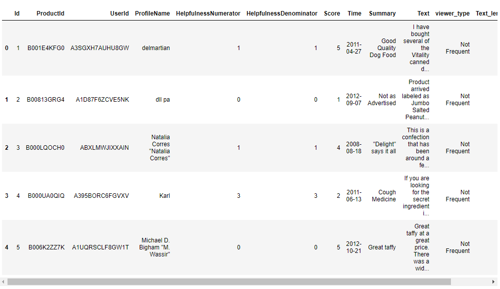
sample_negative = sample[sample['polarity']<0]

sample_positive = sample[sample['polarity']>0]
This code separates the DataFrame sample into two separate DataFrames: sample_negative, containing rows where the sentiment polarity is less than 0 (indicating negative sentiment), and sample_positive, containing rows where the sentiment polarity is greater than 0 (indicating positive sentiment).
sample_negative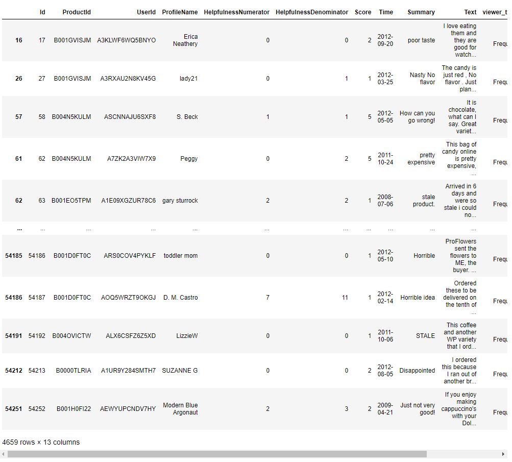
sample_positive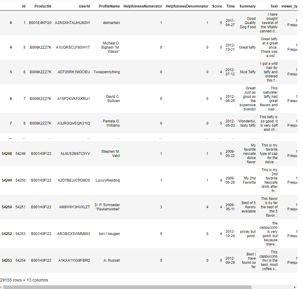
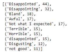
from collections import CounterThis code uses the Counter class to count the occurrences of each unique text in the ‘Summary’ column of the DataFrame sample_negative, which contains rows with negative sentiment polarity. It then returns the 10 most common texts along with their respective counts.
Counter(sample_negative['Summary']).most_common(10)This code returns the 10 most common negative sentiments found in the ‘Summary’ column of the DataFrame sample_negative, along with their respective counts.
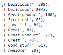
Counter(sample_positive['Summary']).most_common(10)This code returns the 10 most common negative sentiments found in the ‘Summary’ column of the DataFrame sample_positive, along with their respective counts.
Import Statements: Import necessary modules from plotly for interactive plotting.
Conclusion
The Bitcoin Price Analysis project provides a detailed and interactive examination of Bitcoin’s price history over a significant period. It offers useful insights into the trends and performance of the cryptocurrency, proving to be a practical resource for investors, analysts, and those interested in understanding Bitcoin’s market dynamics.
GitHub
Tableau

Kaggle
